The navigation drawer is a hidden menu that organizes app journeys. As mobile usage grows, this UI gem keeps users hooked effortlessly.
Navigation drawer in Android thrives on Material Design principles, using components like DrawerLayout for seamless slide-out panels. Navigation drawer in iOS, however, leans on gesture-based fluidity—think edge swipes or subtle hamburger icons that align with Apple’s minimalist ethos. Both ensure users navigate faster, but their design philosophies cater to platform-specific expectations.
Drawers declutter screens, ideal for web to APK or web to IPA conversions. They transform website layouts into clean app interfaces, letting users focus instantly on essentials—no overwhelming menus or tabs.
Customization elevates engagement. Add gradients, animations, or themed icons—like a fitness app’s drawer styled as a workout playlist. Small touches make navigation feel personal and intuitive.
Why does this matter? Apps with smooth navigation see 30% longer session times. A well-placed drawer reduces friction, guiding users to features they love without guesswork.
Even better: Tools like Appilix automate drawer creation for Android and iOS. Turn websites into apps with native-like navigation in minutes, no coding required.
Ready to stand out? A smart navigation drawer isn’t just a feature—it’s your app’s secret weapon for retention. Start designing yours today! 🚀
What is Navigation Drawer?
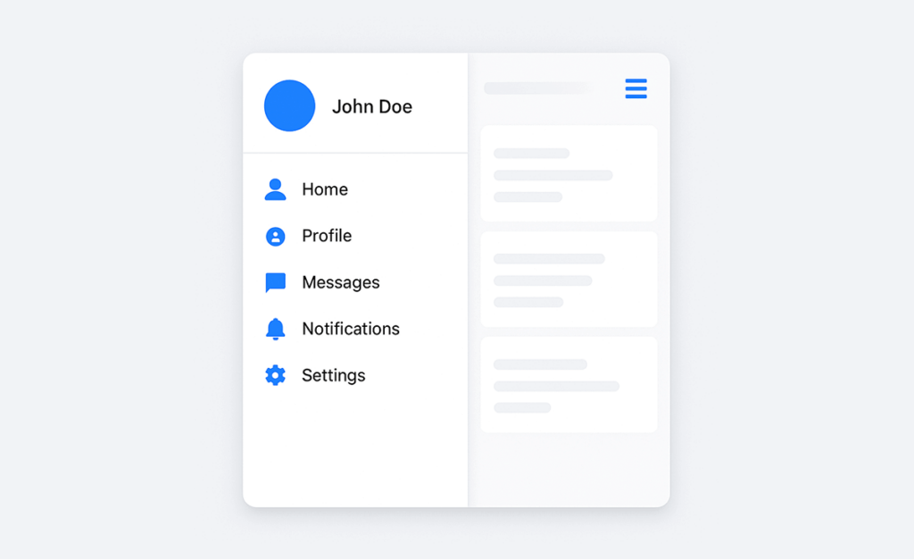
A Navigation Drawer is a widely used user interface (UI) component in mobile and web applications that provides quick and intuitive access to different sections of an app. Typically hidden by default, it slides in from the side—usually the left—when a user taps a menu icon (commonly represented by three horizontal lines, known as the "hamburger" icon).
The main purpose of a navigation drawer is to organize app content in a clean, accessible way without overwhelming the main screen. It acts like a control center where users can jump between core features such as Home, Profile, Settings, Notifications, and more.
Importance of a Navigation Drawer in Mobile Apps
Navigation drawers are a powerful tool in mobile design, helping to maintain a clean and organized interface by storing secondary options in a collapsible side panel. Instead of overwhelming the main screen with too many buttons, a nav drawer slides out only when needed, creating a minimalist yet highly functional layout. This approach is especially beneficial for mobile interfaces, where limited screen space requires designers to prioritize simplicity and ease of access.
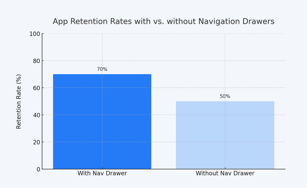
As illustrated in the chart above, apps featuring a navigation drawer show a retention rate of 70%, while those without such a UI feature drop to just 50%. This 20% increase in retention underscores the importance of intuitive and user-friendly interfaces.
On the other hand, apps without navigation drawers often rely on more complex or less accessible navigation structures. This can frustrate users and lead to a higher churn rate, especially if essential features are hard to find or use.
Setting Up a Navigation Drawer in Appilix - Web to App Converter
Now, let’s dive into a detailed tutorial on how to set up and customize a navigation drawer using Appilix. This guide covers the steps for both Android and iOS apps.
Step 1: Access the Appilix Dashboard
Firstly, use Appilix to convert website to mobile app and access your project dashboard. Here, you’ll find tools to customize your app’s design, features, and navigation—ideal for refining web to app conversions.
Step 2: Locate Navigation Drawer Settings
From 👆 Integration Modules page, enable Navigation Drawer module. Then from the left side menu, navigate to 👆 Navigation Drawer. Appilix simplifies setup with pre-configured options for Android and iOS, ensuring your website to app transition feels native on both platforms.
Step 3: Add & Organize Menu Items
Structure your drawer to mirror your web to app content:
- Add Menu Items: Assign titles (e.g., “Shop”) and link actions (e.g.,
https://yoursite.com/shop). - Back Navigation: Use 📌
appilix-navigation://backwardor 📌appilix-navigation://forwardor 📌appilix-navigation://reloadfor intuitive backward, forward or reloading flows. - Sub-Menus: Prefix titles with
^^(e.g.,^^Products) to nest categories—perfect for organizing complex website-into-app content.
Step 4: Customize the Look
Align the drawer with your brand:
- Colors: Match your website to app palette for background, text, and icons.
- Fonts: Use web-friendly fonts to maintain consistency.
- Icons: Upload custom icons (e.g., a cart symbol for “Shop”) to enhance familiarity for web to app users.
Step 5: Save & Preview
Test your drawer’s functionality by rebuild the app. Ensure smooth transitions between screens—critical for website into app projects aiming to replicate desktop ease on mobile.
Pro Tip: For web to app conversions, sync your drawer’s menu structure with your website’s sitemap. This creates a seamless experience, as users navigate your app just like they would your site—but faster!
Designing a Seamless Nav Drawer: Tips and Best Practices
A navigation drawer is a key element in modern mobile app design, offering users an intuitive way to navigate through different sections of the app. However, its design can make or break the user experience. A seamless navigation drawer is both functional and easy to use, contributing to a smoother and more enjoyable app experience. To achieve this, here are some essential tips and best practices:
1. Prioritize Simplicity and Clarity
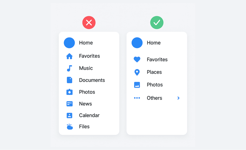
The main purpose of a navigation drawer is to make navigation easier, and this can only be achieved when it’s simple and clear. Overcomplicating the design or adding unnecessary items will confuse users, leading to a less-than-ideal experience. The key is to include only the most important options and to organize them logically.
Best Practice:
- Limit the number of menu items to what users need most. For large apps, group related items into submenus to maintain clarity without overwhelming the user.
- Use short, descriptive labels for each section. Avoid jargon or overly technical terms to ensure clarity.
2. Ensure Easy Accessibility
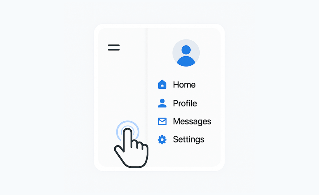
A navigation drawer should be easily accessible without disrupting the app’s flow. Users expect to open the drawer with minimal effort, whether through a swipe gesture or a clearly visible icon, usually in the top-left corner. Accessibility is crucial to keeping the app experience smooth and intuitive.
Best Practice:
- Enable swipe gestures from the left edge or use a hamburger icon for easy access.
- Allow the drawer to be dismissed by tapping outside of it, giving users control over the interaction.
- Ensure the drawer works well on both small and large screens for a consistent experience across devices.
3. Design with Branding in Mind
Your navigation drawer should reflect the branding of your app. Consistency across the app’s design—such as colors, fonts, and icons—creates a cohesive experience and reinforces your brand identity. A well-branded navigation drawer not only looks professional but also helps users feel more connected to your app.
Best Practice:
- Use your app’s brand colors, typography, and logo in the header of the drawer to ensure it fits seamlessly into the overall app design.
- Maintain consistent iconography throughout the drawer to keep the design clean and recognizable.
Conclusion
The navigation drawer is a game-changer for web to app projects, offering users a sleek, organized way to explore your content. Whether converting a website to APK for Android or a website to iOS App, this UI element ensures your mobile version feels native, intuitive, and clutter-free—key to retaining today’s fast-paced users.
With tools like Appilix, building a polished navigation drawer takes minutes, even for web to app newbies. Turn your site into a mobile powerhouse, customize every detail, and watch engagement soar. Ready to redefine your website to APK or iOS journey? Start now—your audience won’t look back! 🚀
